Over the past five years, American landscape master Stephen Shore has scanned hundreds of negatives shot between 1973 and 1981. In this fantastic volume, Aperture has invited an international group of fifteen photographers, curators, authors, and cultural figures to select ten images apiece from this rarely seen cache of images and write a commentary.
Like the best rambling nineteenth-century novels, Stephen Shore’s Uncommon Places is an embarrassment of riches. Attuned to time and place, it teems with so much life it is overwhelming. I once asked Stephen if he knew how many photographs he had taken for this project. “I don’t,” he replied, “but I know that the number of pictures I find interesting is close to seven hundred.” I then asked how it was that within months of picking up a 4-by-5-inch camera, and then a 10-by-8-inch, he was making work of the very highest standards.
“I can’t explain it. It would be awfully self-congratulatory to agree with you, but I understand what you’re saying.” I think even he is still trying to fathom the work’s depths.
In 2014 I wrote a book titled The Open Road: Photography and the American Road Trip. It includes a group of pictures from Uncommon Places, mixing celebrated images with the lesser known, as an entry point for newcomers. This time my choices are very different.
I wouldn’t say it is a more personal or obscure selection, but it is definitely a narrower look.
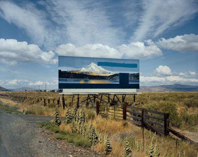
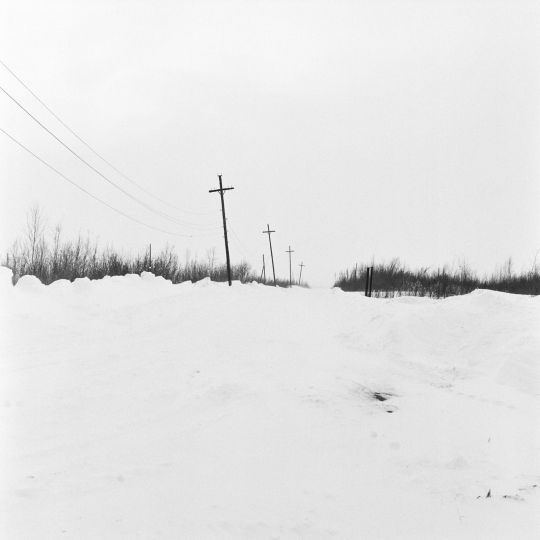
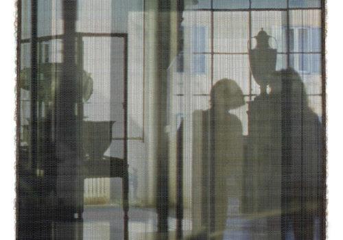
For me one of the joys of Uncommon Places is the infinitely delicate understanding of the color green. As the prime color of flora, green is eternal. As a color for cars, clothing, plastics, and the like, it goes in and out of fashion. Clearly Stephen was drawn to nature and manufacture, and in his photographs the relationship between them is by turns fraught, funny, poignant, surreal, and occasionally harmonious. You can see it in the greens.
In photography green often seems to be the most transparent color. By this I mean it’s the one that encourages us to look “through” the image as if to the world beyond. When we see green in a photograph, we tend to think it’s the unmediated color of the world that was before the camera. Stephen has often spoken of his interest during this project in the classical “picture window” and the illusions of three-dimensionality. Greens certainly helped him explore this.
We don’t have this feeling with photographed reds, blues, and yellows. So if an image sets off its green against one or more of those colors, something very complex can happen. This complexity is pictorial and aesthetic, but it’s also a complexity of the world itself. At the moment, the photographs by Stephen that I am most drawn to are the ones that keep me switching between nature and manufacture, depth and flatness, green and other colors.
Walker Evans once described color photography as vulgar, and therefore valid “when the point of a picture is precisely its vulgarity, or its color-accident through man’s hands, not God’s.” There’s some truth in that. We can all think of great examples, and there are many in this book. But Evans was writing in 1969, when color reproduction was still quite crude. I think he would change his mind if he saw how sensitive it has become. Today it is perfectly possible to picture nature and the work of man’s hand in the same image. It’s a challenge to do it well, of course, but the rewards are enormous.
David Campany
David Campany is a photography writer. His essays have appeared in numerous books, and he is a regular contributor to Aperture and Frieze. Campany’s traveling curatorial project a Handful of Dust was published in 2015 and exhibited at Le Bal, Paris, and the Whitechapel Gallery, London, 2017.
Stephen Shore, Selected works 1973-1981
Published by Aperture
$68